

The Challenge
Our Approach
Services Provided

TIER1
Brand Launch .
We forged the brand voice with two distinct essences, each serving a purpose whether it’s off-day or game-day. On off-days, the Titan is a welcoming and inclusive presence, willing to talk not only to the local fans, but those who play and enjoy Overwatch as a pastime.
On game days, we shifted into a higher gear. The tone became competitive, highlighting confident language and replies paired with banter where necessary. The Titan was humble in victory and graceful in defeat, but never scared to “clap back”
TIER2
Art & Design
After the spectacular victory in the Stage 1 Finals, the Titans were receiving universal praise not only for their in-game performance, but also for their Social Assets. In the latter category, one more team stood out, the Hangzhou Spark, and we decided it would be good fun to create a campaign out of our upcoming regular season game - An Art Battle.
The campaign was a resounding success as neutral fans began taking sides and tweeting at both teams utilizing the #ArtBattle hashtag. The Titans crushed the Spark 4-0, winning the “event” and presenting the fans with 2 posters for the match announcement and victory outcome.
What’s more, the demand for our “loss” asset was so great, that we asked our followers to RT a tweet 500 times in order for us to reveal it. The number was reached in 12 minutes, prompting us to release the asset minutes later .
TIER3
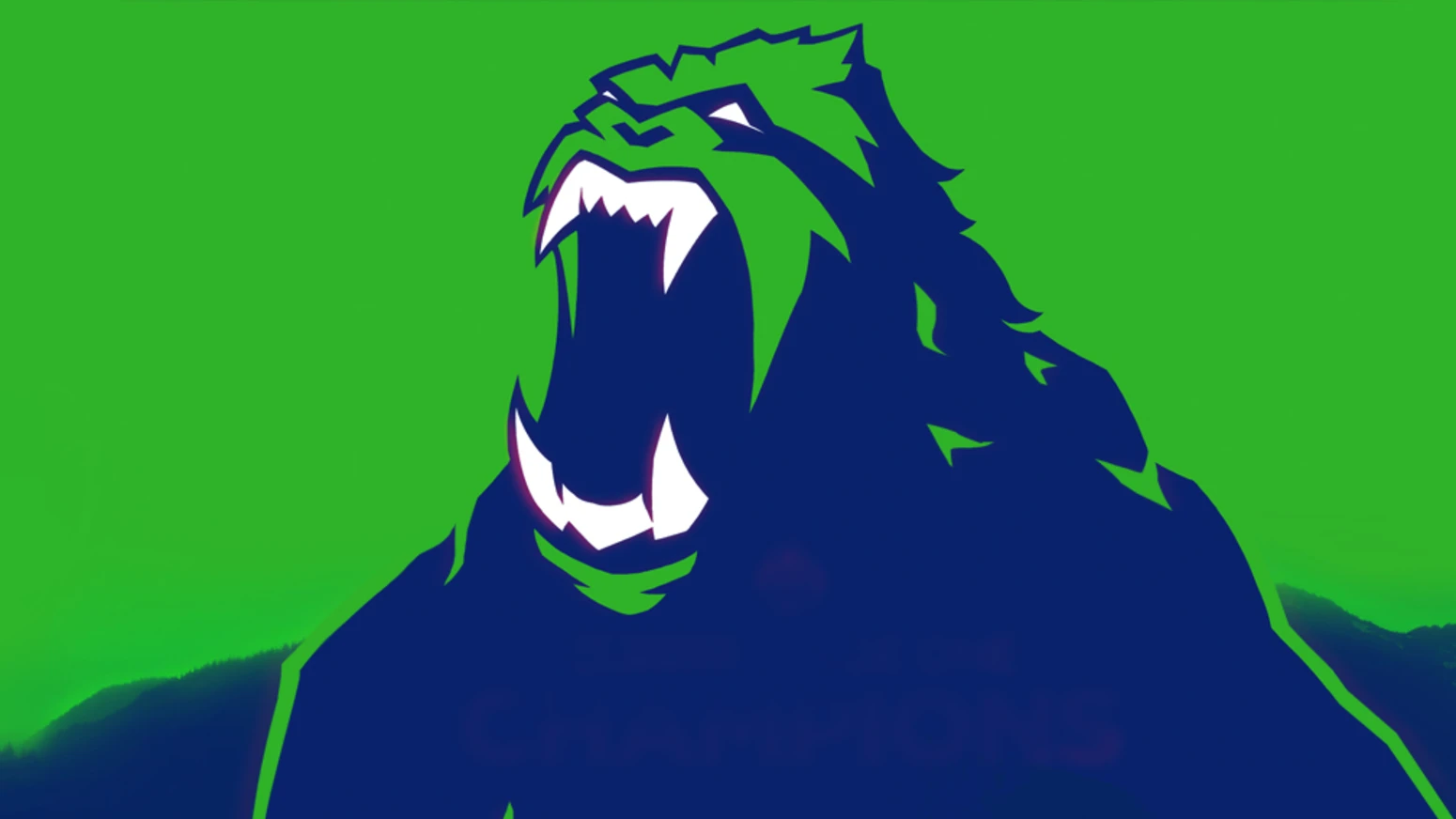
Motion Design
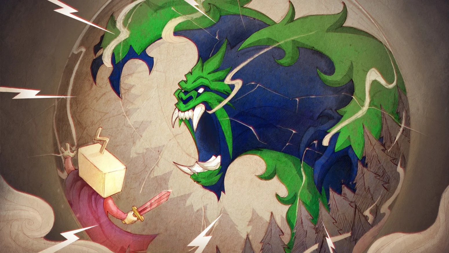
The Titan is a giant beast of primal relentlessness and motion was the perfect place to show that. We had the Titan devour other team logos, march tall and proud above city skylines and during key matches - claw the asset to pieces .
FINAL TIER
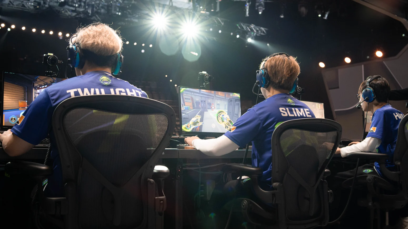
Videography
The Titans were a colourful bunch between boastful, larger-than-life characters and shy, yet funny heartthrobs. Given their incredible competitive record and the brand surrounding them, we used up-shots in most of our video work.
Underlining the brand, but not exaggerating the perspective, we strived to build the players up as individual “Titans” both as competitors and as people .
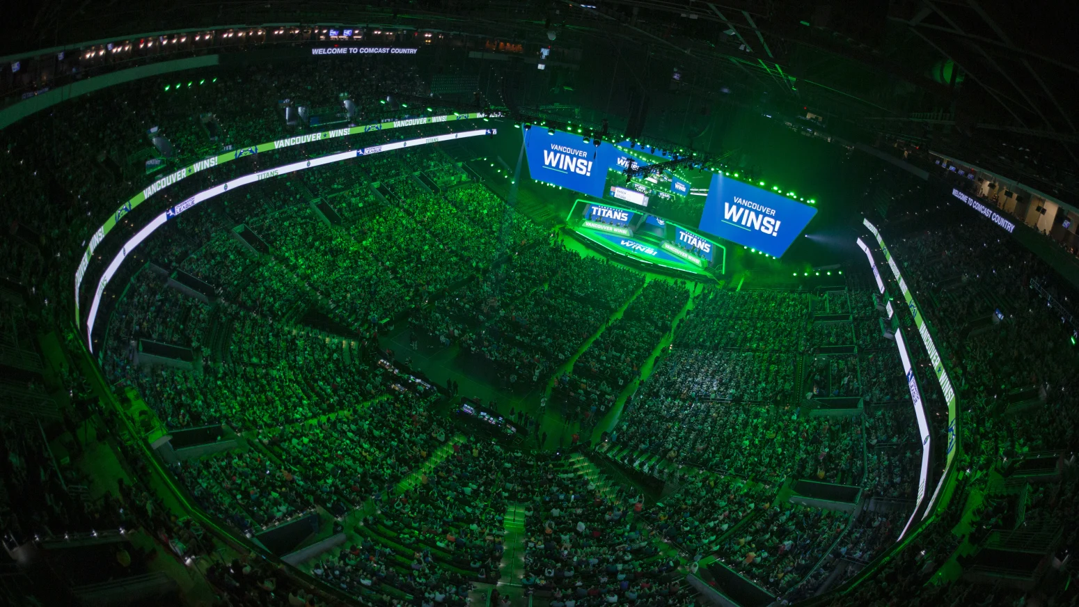
Season 2 End Metrics
Results
The Titans accumulated a loyal fan base with ease. Our Instagram live coverage of games quickly became a staple of the League once rolled out in February. Instagram was where the Titans excelled the most. The team’s account was the second most followed (62,000) out of all 10 new entrants in the League’s second season and was the 4th most engaged account in the entirety of the League, scoring 1,009,000 engagements